My thoughts on my childhood as I see how some creatives use advertising on print
I’ve had my own share of embarrassing stories, but there’s one thing that one of my aunties like to tell me: When I was a tot, I used to read Manila Bulletin (and I think I remember that).
Fast forward to when I was a young boy living in a cool subdivision in Antipolo, there was this ad for Disney’s “The Incredibles” by Globe. It’s a full-page ad, placed in the back of the newspaper’s A section. The ad has a mockup of a newspaper’s page A3, but then The Incredibles pop out, “tearing” though the middle of the page. The bottom part states that mobile content for the said movie is available for download.

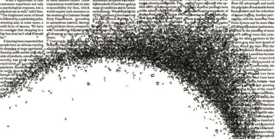
That’s not yet the worst. There’s this ad for Shell that’s placed I believe on the last few pages of the A section — a quarter ad placed in the upper right. An anchor dropped over a swarm of letters, creating a disarray until it reaches a photo of an ocean featuring beautiful marine life. I have a specific term for this: Scrambles. I hate looking at these ads. You can call these “creative,” but it felt to me like it scarred me for life.
Thank goodness there’s no more of these — in my perspective, it’s not effective, and it scares the wits of me to a point that I have to slowly (as in slowly) unfold the darn page.
On the other hand, there’s creative print ads that are subtly placed and not that scary to see. Here’s a few that I saw.
https://www.buzzfeed.com/copyranter/this-game-of-thrones-ad-is-the-best-print-ad-of-the-year
https://www.behance.net/gallery/14291979/Cocinas-Corona-For-Newspaper