Today, November 15, 2021, the stations of Manila Broadcasting Company (MBC) rebranded themselves. On this post, we compare the old and new, and why I’m liking the changes.
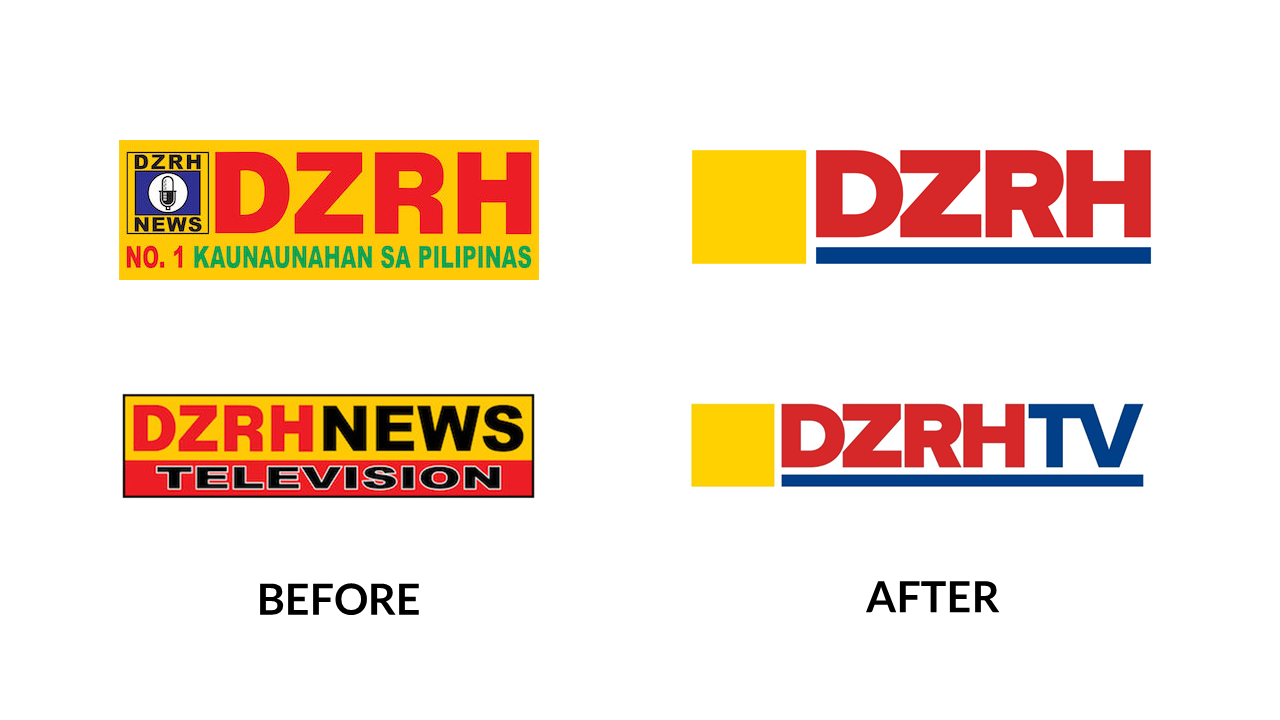
Let’s go with the change we saw the most during this transition: DZRH. What’s running on my mind is logo oversimplification. Here’s a funny example:
https://www.youtube.com/watch?v=LoYP2mEJDJs
There. There we go. DZRH’s new logo gave up on the mic, which I believe is the second iconic element next to the callsign. I’m calling you guys out with my mic on hand - where is the mic?
At least when you look far you can easily recognize it somehow.
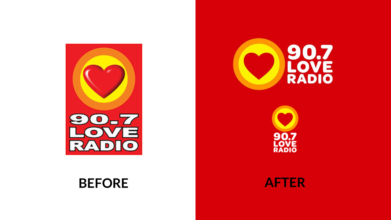
Next is Love Radio, which according to them is the top radio station in Manila based on radio research surveys. I love the typeface. Goodbye overstretched Arial font with thick outlines, hellooooo great typeface. They do have a white variation of this, which is also nice because you can’t have red all the time.

Moving on to the second oldest FM radio station of the company, Yes! The Best. Yes, this is a better rebrand. The colors are kind of toned down if we compared it to the bolder colors used before, but the minus is redeemed by the new branding which consist of a modern typeface.
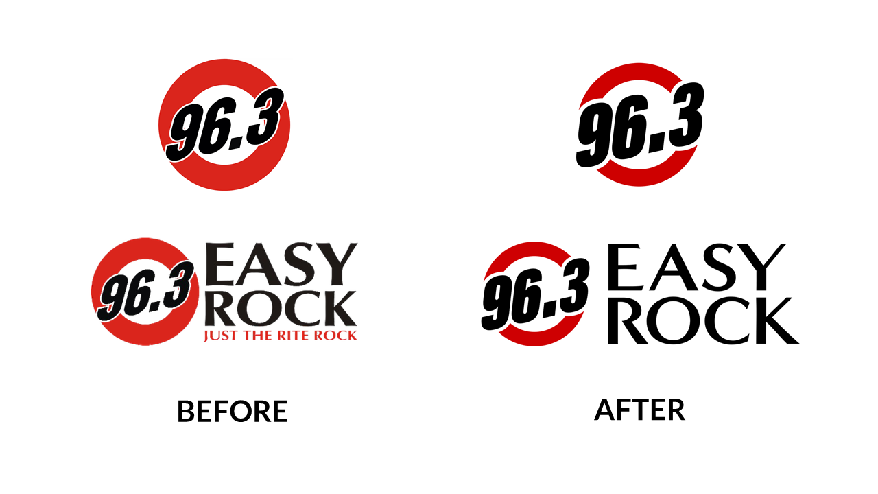
The youngest FM station concept of MBC also got a slight rebrand. Easy Rock’s logo now has a slimmer ring to it. This way, the change made it less like a target (like, you can add one small circle inside the ring and boom, Target). Now that’s Easy to me.
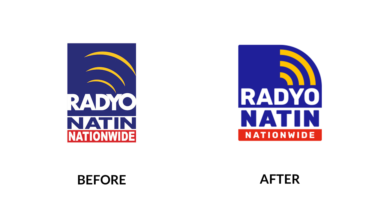
MBC’s community radio network, Radyo Natin, also got its facelift. The typeface in “NATIN” felt a bit stretched, but overall, the facelift is fine.
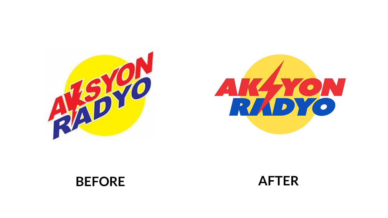
Lastly, its other provincial radio network Aksyon Radyo felt bolder with the change. Gone with the times where we have to look at the K like a thunder (because it’s awkward, and glad to know the guys at MBC knew that). The S in Aksyon is muuuuuch better. Much, much better. The S overlapping the A in Radyo is also a nice touch. As Thanos says, “Perfectly Balanced.”
Congratulations to the Manila Broadcasting Company for the rebrand, I like it overall. The question is this: Will MBC have its own logo rebrand or it will stay with its C-swipe logo?